
Hi guys! Last week I took a couple of days off for a quick last minute getaway with the fam before the school year began. We headed down to Baltimore to visit the AVAM (looove that museum!), catch a ball game, and attend the Baltimore Comic Con!
My 9 yo daughter reads select comic titles and is a fan of illustrator-comic artist-writer-nerd-cat enthusiast, Katie Cook of My Little Pony fame. To my daughter's delight, Katie was in attendance at the con and offering small custom watercolor sketches while-you-wait! So my kid asked Katie to draw (what else?) a Harry Potter cat. Happy to oblige, this watercolor of Harry & Hedwig was complete in minutes :)

Thrilled with the end result, I told my daughter she could help choose framing materials at the shop to showcase her very first piece of original art.
My brain works involuntarily upon seeing art on my design table. I am automatically selecting mouldings in my head and seeing a finished product. As soon as the art went down: big black Isabella frame. Wasabi silk mat.
Now to convince child. I put the giant frame down on the table near the tiny 3 x 4" paper, and she instantly said, "No! that's way too big!"
And now the child is a client. Everybody says that when I put down a large scale frame. I happen to love the look of a big frame on little art, but it is a tough sell. And I understand visualizing the finished product based on one corner sample is really hard. A leap of faith.
As I'm explaining this to someone who is not even ten, I am seeing it through her eyes.

Yes, the frame is bigger than the art. And yes, that mat color is not present in the art. And I can see how that looks kinda out there.

And, by the way, I think it would also look great floated and raised. (Pretty sure that wasn't making sense to her either.)
She was still not convinced. We tried other mat colors at this point, but she conceded that Wasabi was bright, fresh, fun, and playful. But the frame was still obnoxiously large.
"But wait!" I said. "There's software that can show you what it will look like when it's complete!" And I uploaded a photo of the art to Larson Juhl's Virtual Framing Tool. (This is a great tool to play with if you're so inclined and I have used it in the shop from time to time when these situations arise.)
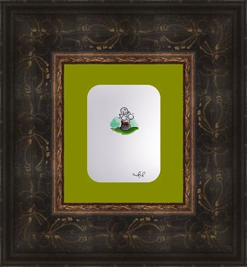
While the image the tool generated is not quite right (the mat color is a little more in-your-face, and there's no dimensionality with the floating art), this was all she needed to see. "YASSSSS!!!"
And so it was done : )

TL; DR -- Sometimes a big frame serves to enhance the art. And also listen to your framer/mom.