Wednesday, March 23, 2011
Design of the Week
This design is not for the feint of heart. The color combo here is intentionally in-your-face. The art is a gallery poster for a modern urban show.
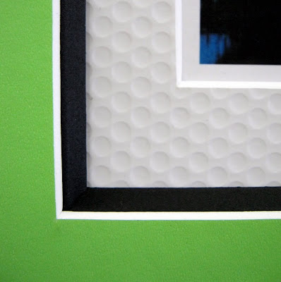
Here's my favorite part: the 1" wide exposure on the textured white bottom mat. I saw this dimpled mat and thought street art, kids portraits, danish modern! However, when I turned the sample over, I discovered it was part of a sports line by Crescent. This one is supposed to emulate a golfball. (I also have their basketball and football inspired mats.) Whatever. This mat is hot.
The design also incorporates a vivid vinyl-coated top mat, black bevel accent (love these things!) and a bold sensibility.


