
Color Theory Edition
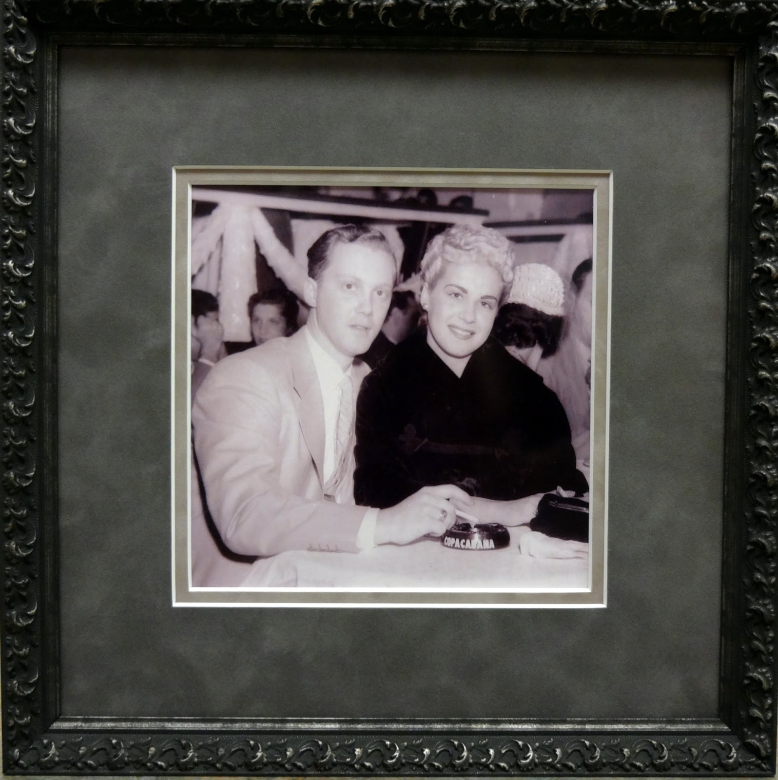
A client came in with this previously framed cherished vintage photo from his family below.

It is framed gallery style in a flat matte black style with neutral mat. The client was dissatisfied with this design as it made the color of the photograph look really purple. Also he wanted it cropped to lessen the distraction of the background strangers in the photo.
No problem!
When cropping , I suggested a perfect square as opposed to a squarish-rectangle as square shapes are so much more pleasing to the eye. Almost-square rectangles are annoying. (Some standard size rectangular prints like 4 x 6 and 8 x 12 are pretty close to golden, the most lovely of all rectangle proportions. Thank you, printing industry!)
And as for color, this is a problem frequently encountered with vintage photos. I have had success in the past using muted mats in the same color family as the tinted photo. Below is a purplish-gray top mat and slightly pinkish-gray bottom mat. We are trying to create a purple tinted environment so the eye accepts it as a purple tinted world.

Next we add a dark pewter ornate frame and the look is complete.
 |
| the completed project |
 |
| before & after |