
During the late 1980s / early 90s the Western world got its first comprehensive look at Soviet propaganda art of the Bolshevik Revolution when the 4000 known works were catalogued and studied by Western art historians. These posters--from small period of time 1917-1923-ish--were also revolutionary in terms of graphic design, use of collage, and typography.
The Museum of Modern Art, in its 1997 exhibition of film posters of the period suggests "These works, albeit of a popular genre, were revolutionary with respect to the history of design. The [artists'] numerous innovations—the rethinking of the content of the poster, the introduction of implied movement, the expressive use of typography and color, the distortion of scale and perspective—were subsequently investigated and extended by other designers and movements. Many of the [artists'] experiments with letterforms can be seen as precursors to the phototypographic advertisements of the 1960s. And their facile manipulation of pictorial space seems remarkably prescient in light of the infinite mutability of the photographic image made possible by the desktop computer only in the last [twenty-five] years."
Mr. Fatale and I attended that MOMA exhibition, and it was gorgeous. It was. Mind-blowing. The posters exhibited were enormous in scale and totally saturated in color.
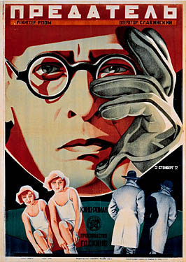 |
| The Traitor. 1926. Offset lithograph. Batsu Art Gallery, The Ruki Matsumoto Collection, Tokyo. |
So into my shop last week, walked a client with these two authentic posters:
 |
I was thrilled to see them in the flesh. These were not designed to be permanent works of art--they are printed on newsprint and extremely fragile. These are in great shape, considering they are 100 years old and from wartime halfway around the globe.
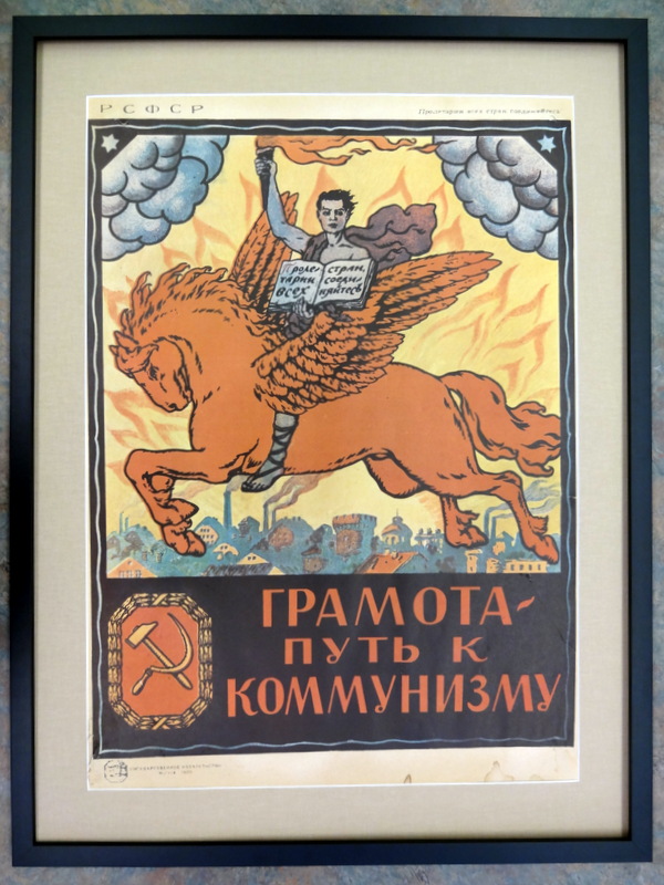
The client wanted them framed elegantly, but simply. We went with a gallery black frame and beige linen mat. She wanted the finished sizes to be identical and no text obscured. You can see in the lower image that I minimized the appearance of the paper loss in the lower left corner using simple framing techniques. I should also point out that the images are not square. These were made pre-mid-century drafting tools, and produced quickly to get their urgent messages out. I think they look pretty awesome, regardless.
At home, I found on my shelf a reference book I'd purchased right after the MOMA exhibit, 16 years ago.

It clearly illustrates the evolution of Soviet design, from folk & religious iconography to early abstract constructivism. It represents about 200 images of the 4000 known works. There are maybe 100 colorplates. There in Chapter 5, I spied these beauties:
 |
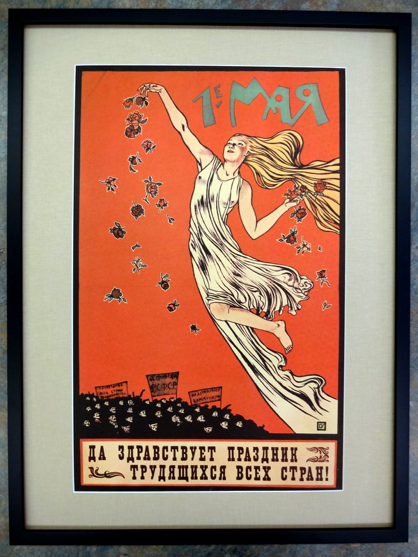
| S. I. Ivanov, I-e maya. Da zdravstvuet prazdnik trudyashchikhsya vsekh stran! (1st of May. Long Live the Festival of the Workers of all Countries), colored lithograph. |
 |
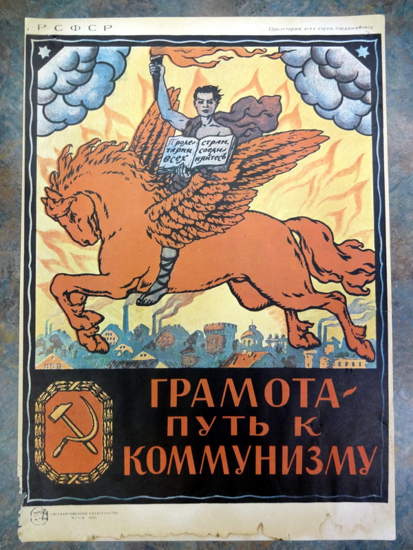
| Anon, Gramota -- put' k kommunizmu (Literacy is the Path to Communism), colored lithograph, 1920. |
How fortuitous! I was so glad to be able to share with the client the info contained in the book about her posters' place in history. I believe these were purchased at a New York gallery, in the late 80s/early 90s when these striking images were just emerging in the West.