Showing posts with label raised mat. Show all posts

Friday, November 22, 2013

a tale of two citymaps

(and other stories)

A lovely young couple entered my shop with an awesome piece of art.  It was a large hand-cut map of Washington, DC.


Just fantastic.  It was done by an artist, Karen Mee Hyun O'Leary, using an x-acto knife and 100 lb bristol paper.  The effect is a clean, minimal, lace-like but sturdy piece of art meant to evoke good feelings and memories about a specific place.

The couple had clear ideas on how they wanted their map framed.  They wanted to highlight the cut-outs by elevating the art high above an interesting background.  They selected a neutral color palette, a light gray -- both as a background color and as a top mat.

Below is a photo of the mat on the background color before I raised it using two layers of acid-free foamboard (3/8" total depth) and adding the top mat.  Truth be told, I had never handled art this lacey and raised this high.  I was concerned the art would sag in the middle.  So I tried a new mounting technique I learned called a "trampoline mount" taught to me by an art conservator at a recent framing seminar.  Worked like a charm.


Below is the finished project, art raised high and casting a shadow below.  The couple chose the most gorgeous 3 1/2" charcoal burl veneer frame and museum glass.  So beautiful!  


So in the short window of time after I finished the framing and before the couple came to pick it up, another client arrived to collect his finished piece.  He saw this map out of the corner of his eye and he said, "Do you mind if I take a closer look at this piece?  I have a friend who makes art like this."  He had gone to architecture school with the artist!  Long story short, by the next day I had coordinated with the artist to make small neighborhood maps of East Passyunk Ave to sell here in the shop!

And just today she has completed the very first one!


These will be in the shop in time for the holidays!

You want to know something else?  I had already designed a holiday window for the shop that is all maps and snowflakes.  No lie.  Frame shop synchronicity.

A few other things to run down before I get to other recent projects:

*  The shop will be CLOSED on Thanksgiving Day.

*  We will be OPEN on Black Friday, 10 - 4pm.

*  We will be OPEN on Small Business Saturday, November 30th, 11 - 6pm
In fact, we are an Amex Registered Small Business.   American Express Card Members can get a $10 credit for using an AmEx for a purchase at a registered business on Small Business Saturday. In order to be eligible for the credit, you must register your card on November 24. There is a limited number of credits, so don't wait!


*  There are only two weeks left to see Marker Magic, our wonderful collection of marker drawings by Kate Kern Mundie and fundraiser for Jackson School.  These unique, colorful drawings of our neighborhood (and beyond) make fantastic gifts.  He who hesitates...


Last week's projects:

My first bicycling jersey arrived in the shop!  Weird, right?  I have been framing for 15 years and have framed just about every kind of sports jersey there is (Rugby, Lacrosse, etc), but never a bicycling one before.  I actually had to google how they're traditionally done.  Should it be folded?  Should the sleeves be out or folded down?  Now I know.

Here it is as the client and I were laying it out.


And here it is with me in the middle of work.  There are a lot of techniques here and they had to be done in a certain order.  The opening for the photo was cut first, then the racing number was floated on top, here I am measuring where to cut slits for the medal straps to go through, and finally then the jersey would be sewn down to the backing.


The completed project:


 Below here is a shallow shadowbox for items from a young lawyer invited to a Supreme Court hearing.  The quill pen is something given to all who share this special honor.  It is held in place by thin monofilament stitches.  No adhesives.   A beautiful burl frame and wide gauge linen mat.


And lastly, this is a stunning landscape photo, framed up grandly with a wide white mat and gray bevel accent.  Bevel accents fit inside the opening of the mat and raise it to dramatic height.

This design also make use of that glorious charcoal burl frame that was used on the couple's map from earlier in this post.  Museum glass here, too.  A beauty.


'Til next time.  Happy Thanksgiving, everyone!

xo


Tuesday, July 23, 2013

this week / last week


This week:

CAR SHOW!!!  East Passyunk Ave's biggest event is this Sunday (rain date Aug 4) and the shop will be open from 12 - 5pm!

This year is better than ever with lots of street food (under $5), kid stuff (moonbounce & facepaint), crafts (Bang! Boom! CRAFT fair at the fountain), and CARS!  See you then :)

Also we are entering the final days of our current gallery installation, Box Score:  mixed media baseball collages by Randel Plowman.  These are stunning limited edition prints featuring vintage Phillies (et al) players, framed in natural hardwoods.  (Prints available framed or unframed.)

The Line Up, by Randel Plowman


Last week:
Always framing lots of interesting stuff!

Below is a print titled, A Very Lovely Lady, by Ben Woodward in a beautiful handpainted Isabella frame.


Below here is a print in one of the brand new styles here at the shop:  Devon.  It has a unique matte finish and works beautifully on sepia...


Or graphite, as shown below (the art is two from a triptych--renderings of wolf skeletons by Gendron Jensen).
 Below here is Peruvian art in a dramatic dark monochromatic frame design.  Mat is 4" wide :)


Next is art nouveau art in an art noveau frame!  Note the floral motif is the same species that appears in the art!  (Love it when that happens!)


And finally below here is a print, The Ossining House by Carson Ellis.  I was a little late to the party, but now I realize that Ms. Ellis is the artist behind all of The Decemberists' great album covers.

This print is awesome:

source
We went with with a quirky but warm woodland design, wide flat carved walnut frame, raised pale brown mat over the print floating on a peach-colored backing mat.  I am so pleased with how this turned out!


xo

Friday, May 31, 2013

eastern textures


Some wonderful Eastern treasures came through the shop lately.  The first is an original painting on paper from India.  I happen to have handled a lot of Indian art in my career, mostly paintings on silk, but this one was a bit different in terms of medium, colors, and patterns.

Generally there are lots of jewel-tones and bead motifs in art from this region.  But what I found most striking about this piece was the olive neutral background and the triangle motif border.  (Those brown circle things are soft leather weights to hold the art down--it had been rolled for some time.)


The client and I arrived at this combination of mat and frame.  The mat is a very saturated olive suede.  We held the sample against the art and knew in an instant this was the thing to do.


Below is a detail where you can see the triangles and lines of the art and how the frame relates.


I didn't intend to put these two together in a post, they are from different clients, and the art from different countries, but in going through my photos, I was struck by the similarity of shape (both long horizontals), and the use of the color green as neutral.

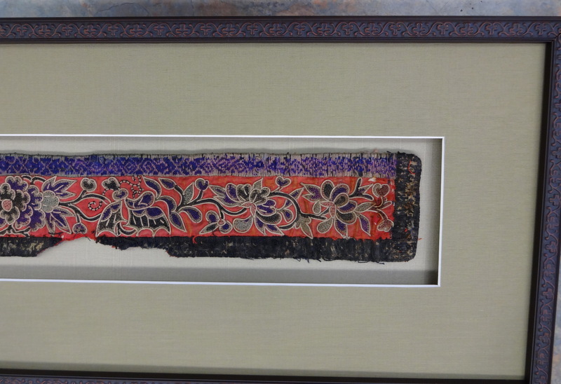
Below is an antique embroidery from China.


The clients wanted a floating design with a raised mat and I totally agreed.  We floated the art on a pale sage green mat, and raised a slightly brighter green raw silk mat above.  This slender dark scroll motif frame finished the design beautifully.


The detail below shows the grain of the silk, which we chose to run horizontally to emphasize length.  This shot was also a test to see if my technique for raising the mat was visible. From any angle.  Nope!  (There should not be any visible framing tricks--mat should appear to be hovering magically in the air.)


Finished piece below.


I've written it several times before, but one of the great things about this profession is the variety of stuff that comes through the door.  I am so lucky to be able to see and handle items like these.  :)


Tuesday, February 19, 2013

roundup

Hi!  I am up to my eyeballs in production (yay!), but wanted to pop in here and show off a few projects involving folks' really cool art.

Below is a big panoramic poster designed to fit into the MTA's advertising spaces lining the overhead in subway cars.


The art is by Duke Riley, artist + patriot.  Details below.  LOVE.


Framed simply in gallery frame and neutral mat.


Next up is an anthropomorphic bird, Fowl with Pearls, by Michael Sowa.  The formality of the portrait and the pearls made us go gilded ornate with the framing.  No mat.  This way it looks more like an original oil painting than a poster.


Below is another elegantly framed piece, this one is a small print (8 x 10-ish) by Mark Ryden.

We went with a blue-green suede mat for the top & a super pale pink for the bottom mat.


And then put it all together in this awesome Bolshoi frame.  I love this whole family of frames--this one has chipped paint and missing beads--just perfect for this type of art.


Below is an original sketch for the design of a Star Trek collectors plate, by artist J Martin.

Of course we had to do a circle-cut mat!  But here I wanted to evoke that 1960s view of the future design sensibility with a double mat--both the same shade of white, the top one raised, invisibly hovering over the surface.  Also, and this is a subtle detail, but the exposure of the bottom mat is 3/8."  This is slightly wider than modern convention--again, trying to evoke 1960s design.


Finished with a dark pewter hammered-look square frame.


More to come!  xo

Thursday, January 17, 2013

pastel


I had a pastel come through the shop recently and I realized I haven't done a post on pastels.  Ever.  

There's nothing terrifying about framing pastels, but there are some tricks.

Pastels as a medium are available in either oil or chalk.  In either case they should be framed under glass, and  the art should not touch the glass under any circumstances.  There's a handful of ways to do that.  This is one of my favorites.

Below is a young person's very awesome chalk pastel interpretation of Van Gogh's Starry Night.


Chalk pastels, no matter if they're spray fixed or not, are powdery.  The chalk dust WILL sprinkle down over time--just a little, but enough to soil the bevel of a mat.  That's just the nature of the medium.  And gravity.  So to combat this problem, we create a space for the dust to go.

I cut a piece of acid free foam board to be a surface for the mat to go on.  This creates a 3/16" channel between the art and mat.

Below the foam board is cut with an opening about 1/2" wider than the mat will be.


The mat goes on top of the foam.  Since the foam was cut wider, it is not at all visible.  The gray mat appears to be hovering over the art.


Add ornate frame and UV glass and this piece looks like a million bucks.


Friday, January 11, 2013

instaglam

An elegant interior designer client brought in this lovely project.

She had gone around her client's home and taken instagrams of the little touches and details that made their space unique.  

Instagram is now so ubiquitous that I have framed them in a variety of ways all ready.  But then she came in and we did them up in a grand style I had unforeseen.


2 mats of neutral but different colors.  Bottom layer has 6 openings with elongated spacing.  Top layer is raised for depth.

raised mat detail


A burnished gold wide leaf-motif frame and museum glass complete the look.  These will hang on either side of a door in her client's entry.

Wednesday, October 26, 2011

before & after


Aren't these sweet?  Cut paper silhouettes from the 1970s.  They're very detailed, too--note reflection in eyeglasses in portrait on the left, and eyelash in the portrait on the right.  

This is another job for my MIL, and the portraits are of Mr. Fatale & his brother.  They were never protected with any sort of glazing, and they've suffered a bit from exposure.  I had a clear picture in my mind of how I wanted these to look when finished:  I wanted a really ornate mat, an intricate black & white design with an oval fillet.  Nevermind that I don't have a CMC (computerized mat cutter) in house, and oval fillets don't exist.

However, at some point in my storied career in framing, I became a certified Wizard operator/trainer.  (Wizard is a brand of CMC.)  I can install, maintain, and operate these things, and I am certainly aware of their capabilities.  I sat down with the software and came up with a 3-tiered design of shapes there were not intended to go together.


I printed out my idea and found a place with machine in this town, and some nice industry folks willing to help a framer out :)

the machine


bottom layer

And just as my idea was coming together, Crescent Cardboard began to test market a new product:  Flexible Accents.  These can be used in ovals like a fillet!  They're not available to frame shops yet, but I was able to get some samples to test.


 I sliced some up before removing the adhesive film.

backview

And fit it into my oval.


raised middle layer

top layer

I wanted these to look like an illuminated story book, with a garden feel.  That's why I chose this acanthus leaf motif frame.

the completed project


before & after